
When you’re getting started in your business, branding is one of the most important things to focus on! Branding encompasses everything from your brand name to your logo. But choosing brand colors can get a little overwhelming.
Trying to narrow down your color choices to a cohesive palette that’s aligned with your business niche and target audience is A LOT to handle.
And when you’re just getting started, it’s a lot easier to DIY your branding than invest in a designer. After all, saving money wherever possible helps you get your feet off the ground in business!
When it comes to choosing brand colors, there actually is a stress-free way to do it. These tips will help you pick the perfect color palette to represent your brand.
Table of Contents
Why Is Choosing Brand Colors So Important?
Color is one of the most fundamental parts of good, recognizable branding. Aside from being instantly recognizable and associated with your brand, colors have emotional weight and spark different feelings in your audience.
That’s right—color is about so much more than looking great. Instead, it’s the basis of how your potential customers will perceive your brand. The colors you choose will help influence an emotional response, entice viewers to learn more, and help foster brand awareness and recognition long-term.
For any business owner, crafting a unique brand story is key. And color helps you tell your brand’s story instantly! The right color palette should be tailored to your ideal customer and their needs, wants, and loves.
Choosing brand colors goes a long way in helping your business become recognizable and enticing. Once you select enticing colors, they’ll be part of your packaging, marketing efforts, logos, and website.
That’s why choosing brand colors the right way is so important!
4 Tips for Choosing Brand Colors You’ll Love
Strategically choosing brand colors is much more powerful than focusing on your personal preferences.
Your branding color scheme should appeal to your audience through aesthetics, emotions, and a unique value proposition.
These tips will help you pick the right brand colors for your business, all with less stress. Remember, getting stuck trying to choose colors isn’t the best move—strategically decide, and then move on to other elements of building your business.
1. Consider Who Your Target Audience Is
The first step in choosing brand colors strategically is to hone in on your audience. These questions can help:
- Who is your target audience?
- What are they passionate about?
- What type of emotional response will your brand evoke?
From those questions, you can start to visualize colors that will appeal to your audience.
2. Pinpoint Your Brand’s Personality
Once you know your audience inside and out, it’s time to get to know your business just as deeply!
What’s your brand personality? This usually is a few adjectives that describe your business to a tee. What characteristics help you stand out from the crowd—why are you a better option than your competitors?
If you’re brand new to business, just brainstorm. Research other companies in your niche and see what adjectives come to mind, and then think about the similarities and differences your business will have.
Now, if you’re already in business, the best way to identify your brand’s personality is to survey your best customers or clients! Ask them which personality traits best describe your business. You can always incentivize them to participate in the survey with a little gift or discount code.
3. Use Color Psychology To Entice Your Ideal Audience
With your audience and brand personality in mind, you can now work with color psychology to find the perfect color to match those descriptions!
People tend to associate different colors with different feelings, emotions, and personality traits. Cooler colors usually signify stability, trustworthiness, and loyalty. Warmer colors usually make us feel excited, energetic, and positive.
Depending on your ideal audience, their needs, and your business personality, choose a spectrum of cool- or warm-toned colors.
Of course, there are always exceptions to these more general color psychology themes. You can get creative while using these general themes as inspiration!
4. Find Styled Stock Photography And Create A Color Palette
If you’re struggling with choosing brand colors, here’s an amazing tip!
Search through a series of styled stock photos to see what appeals to you most. If you find certain images completely beautiful, consider what colors are present!
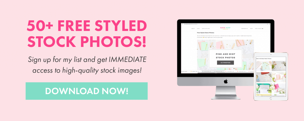
With a Katie Harp Creative Stock Photo Membership, you’ll get instant access to thousands of images and more to come in the future!
To make it super simple and easy, I’ve broken down over a thousand styled stock photos into color groups and other themes, like:
- Pink Photo Packs: Pink and mint, peony office, rose gold marble, hot pink and black photo pack, peonies and money, light pink, pink and gold, pink and gold marble photo packs
- Blue Photo Packs: Navy blue, light blue, navy and pink, pink and navy marble, blue office supplies photo packs
- Neutral tones and natural tones
- More colors of flatlays and office supplies, including…. yellow, purple, green, orange, mint, red, gold, pastel colors, and neutral
- Photos of calculators, money, clocks, microphones, and more perfect for business owners: Tropical Calculator, Time and Productivity, Money and Calculator, Podcasting, Piggy Bank, and Marble
- Letterboard photos and quotes
- White picture frame mockup photos
- Seasonal Photo Packs: Spooky Halloween, Autumn Leaves, Gold and White Winter, Festive Red and Green
Pair these up with branded, easy-to-use Canva templates, and you’re going to be good to go once you find and choose your brand color palette.
We’ve talked a lot about making sure your color palette appeals to your ideal audience. And that IS really important….
But the most important piece of branding is consistency.
Choosing brand colors YOU love means you’ll actually want to use them consistently. That’s why you need to factor your own personality into the branding equation.
Want a pro tip for pulling colors from a styled stock photo you love? Once you download the perfect image, use Adobe’s free color palette tool to extract a color palette! Then, make sure to grab the hex codes (the numbers with a # before them) and save them somewhere convenient.
In Canva Pro, you can even set up a Brand Kit that saves your hex codes and colors automatically so they’re easy to use in every design.
Remember: you’ll want to select one or two main brand colors, a few neutral options, and at least one dark shade to use as text on designs.
Related: How to Create Amazing Branded Photos Using Styled Stock Photography
What To Do After Choosing Your Brand Colors
Once you’re successful in choosing brand colors, what now? It’s time to use them in all of your branding. But where should you use them?
Here are some of the most important things to remember about your brand colors.
Use Your Brand Colors Consistently
First, make sure you consistently use your brand colors to build that amazing brand recognition! Include your colors in your social media posts, website, packaging, marketing materials, and more.
If you’re going to have team members supporting you in design, social media, or marketing, make sure to create a Brand Kit in Canva! You can also create a style guide for reference in other design software.
In that style guide, detail how you’d like different colors and fonts to be used for cohesive branding.
Create Branded Social Media Graphics With Your Brand Colors
Your social media profiles and posts are one of the biggest goldmines to infuse with your brand colors.
When you’re designing social media graphics or planning your Instagram feed, make sure to incorporate your brand colors! Use your core brand color to accent your designs—a bright color makes a perfect accent.
Then, use your neutral shades and dark colors to create contrast between the background and fonts.
Using brand colors to create emphasis in your social media graphics helps boost brand visibility and recognition while appealing to your target audience. That’s part of the reason why choosing brand colors matters so much!
Related: 6 Amazing Reasons You Should Upgrade to Canva Pro
Incorporate Them Everywhere
Once you’ve gone through the experience of choosing brand colors, make sure you start using them everywhere.
This point has been made a few times, but it’s SO important!
Include your new brand colors:
- On your website’s design, slideshow or header images, calls to action, titles, graphics, and buttons
- In any lead magnets, downloads, or presentations
- Across your social media profiles and posts
- Within your packaging
- Inside email marketing campaigns
That list is a great place to start incorporating your brand colors.
And remember, the more consistently you use your brand colors, the better! Choosing brand colors you love (strategically, of course) helps you create graphics in less time, boost brand loyalty, and connect with your audience.
Choosing brand colors might seem a little overwhelming. These tips will help make the process super easy. Soon enough, you’ll have a palette of colors you (and your target audience!) love.
If you’re ready to start creating beautiful graphics with your brand colors, a Katie Harp Creative Stock Photo Membership will save you tons of time! This membership makes graphic design for your business so much easier—and gorgeous, too.