
Visual consistency refers to how all the visual elements of your brand and design have a similar look and go together nicely. Here’s how visual consistency helps your branding and can ultimately grow your business.
Table of Contents
How Visual Consistency Helps Your Branding
First, What Is Visual Consistency?
For our purposes, I’m going to define visual consistency as the way your visual branding and design look and feel the same across multiple platforms, websites, and social media pages.
Your visual branding can include your logo, your fonts, your color scheme, design templates that you use, stock photos that you use, even your brand’s voice, and more.
As I’ve said in previous blog posts, your branding is the personality of your business, so your visual branding encompasses all the design elements that make up that part of conveying your brand.
Being visually consistent simply means having the same look and feel for your brand in multiple places.
Why Does Visual Consistency Matter?
You might be wondering why visual consistency matters, or if it’s really a big deal.
To start – and allow me to put my marketer hat on for a second, because this is not something most designers will tell you – I actually like the idea of split testing different things on social media. I know, I know, but hear me out…
I’ve made a whole lot of Pinterest pins and Facebook ads over the years, and even though it goes against traditional branding advice, sometimes it really IS worth testing out slightly different colors, fonts, or photos to see what performs better on social media. With Facebook ads in particular, sometimes your beautiful brand colors are actually not what will get the highest click-through rate. Or the lovely script fonts just might be too hard to read at a small size from someone’s phone.
So that’s my little caveat first, but in general, being consistent with your visual brand is a good idea.
Why? Think about the brands you know and love and purchase from regularly. You can probably think of their logos right away or would recognize their posts in your feed even if you didn’t see who posted it. (I’m thinking about Wendy’s spicy tweets lol… ?)
Simply put, having visual consistency across your website and social media platforms helps build the know, like, and trust factor and makes you more memorable and recognizable online. This can help boost brand awareness!
All right, so what are some important things you should be looking at in your branding to make sure it’s consistent? Keep reading to find out…
5 Things to Look At For Visual Consistency
1. Your logo, submarks, or watermarks
First up, your logo or related marks! I do know of successful businesses that have gone for years and years without a logo, but generally the owner was (literally) the face of the brand, so even having a simple logo that you use across different platforms and graphics is a great way to increase your visual consistency.
You might also have alternate logos, submarks, secondary logos (like a circular version of your logo), or watermarks, or in the case of Pinterest, often just putting your URL at the bottom of the pin as a “watermark” also works fine.
If you think of something like the Apple logo, Nike logo, or McDonald’s logo, those are all different forms of branding that help you instantly recognize the brand regardless of the content.
2. Your brand colors
This is an area where your brand can really shine – even if you play around with different design elements, you can always bring it back to a consistent message by using the same colors across different platforms.
Of course, that doesn’t mean you have to use every single brand color in every single graphic – maybe you want to have a tiled Instagram feed where you have a repeating pattern of posts with each one being a single one of your brand colors. For example, the primary color of a graphic could be red, orange, or yellow, and then repeat red, orange, or yellow.
Or for maximum consistency, use all your brand colors (and logo and fonts) within one graphic, as long as it doesn’t clash. 🙂
Related: Why Strategically Choosing Brand Colors Matters (& How To Do It)
3. Your fonts
This one is pretty straightforward – I usually recommend having 2 or 3 fonts tops for your brand and using those to create a consistent visual brand. Because I’ve tested many different styles for myself and my clients on Pinterest, we typically use one sans-serif font and one cursive font (if appropriate), but in some cases it’s best to skip the cursive font if it’s too hard to read.
This is a component that should usually be consistent in your branding but you have some freedom to play around with it a little bit on Pinterest to try and increase your click-through rate (especially on ads!).
4. The design templates you use (or general design style) ?
If you want to be fancy you can totally create brand new graphics every time you need something for your biz, or you can save a bunch of time with some premade templates (like the templates in our membership!).
Either way, it’s a good idea to have an overall consistent design style in terms of the layout, graphic elements, or other items we’ve mentioned like your logo, fonts, and colors.
In the case of a site like Pinterest or Facebook ads, you can get away with some split testing of different layouts or styles, but if you’re posting to a site like Instagram, for instance, then I would recommend sticking with your brand style simply because all of your posts are visible at the same time (it’s a little easier to test multiple Facebook ads without everyone seeing the messy differences ?).
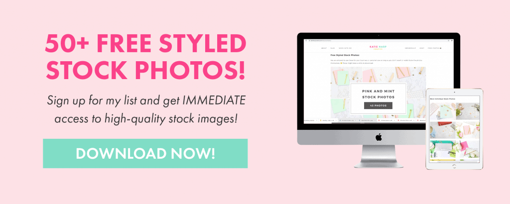
5. The stock photos you use (or your brand photos / headshots)
Stock photos, particularly if they’re from the same photographer or in the same color family, are a great way to add to your visual brand consistency while breaking up the monotony. We offer a ton of stock photos in a wide variety of colors that are perfect for social media, your website, and beyond!
Alternatively, having professional headshots or lifestyle brand photos is an incredible way to improve your visual consistency – what’s more recognizable than a bunch of photos of you??
Ok, I hope I’ve convinced you that having at least some visual consistency in your brand can help your business look a little more professional, memorable, and put together. ?
You can always try new things and get creative on social media, but it’s good to have some kind of branding consistency to come back to at the end of the day, whether that’s a consistent set of colors, fonts, designs, stock photos, or more.
One easy way to create visual consistency is with our Canva templates and styled stock photography. We have sets of templates and photos based on color schemes, so you can find the perfect ones to fit your brand’s unique style.
Good luck!